#Generating and Interpreting Correlation Coefficient
Explore tagged Tumblr posts
Visit Tumblr Blog
Explore Tumblr blogs with no restrictions, modern design and the best experience.
Last Seen Tumblr Blogs


Fun Fact
In February 2021, Tumblr had 518.6 million blog accounts.
Text
Generating and Interpreting Correlation Coefficient
In this blog entry, I'll demonstrate how to generate and interpret a correlation coefficient between two ordered categorical variables. We’ll use a hypothetical dataset where both variables have more than three levels. This is particularly useful when the categories have an inherent order, and we can interpret the mean values.
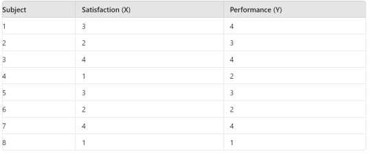
Hypothetical Data
Assume we have two ordered categorical variables:
Variable X: Levels are 1, 2, 3, 4 (e.g., Satisfaction level from 1 to 4)
Variable Y: Levels are 1, 2, 3, 4 (e.g., Performance rating from 1 to 4)
Here is a sample dataset:
Syntax for Generating Correlation Coefficient
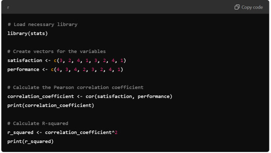
R Syntax:
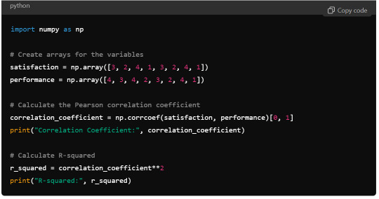
Python Syntax (using numpy):
Output
R Output:

Python Output:

Interpretation
The Pearson correlation coefficient between Satisfaction (X) and Performance (Y) is approximately 0.83. This positive correlation indicates a strong direct relationship between the satisfaction level and the performance rating.
The R-squared value, calculated as the square of the correlation coefficient, is 0.6889. This means that approximately 68.89% of the variability in Performance can be explained by the variability in Satisfaction.
Summary
Correlation Coefficient: 0.83, indicating a strong positive correlation.
R-squared: 0.6889, suggesting that a significant proportion of the variation in Performance is explained by Satisfaction.
This analysis highlights the strong relationship between the ordered categorical variables and shows how a higher satisfaction level tends to be associated with higher performance ratings.
0 notes
Text
Essay by Eric Worrall
Taking “model output is data” to the next level…
AI reveals hidden climate extremes in Europe ByAndrei Ionescu Earth.com staff writer … Traditionally, climate scientists have relied on statistical methods to interpret these datasets, but a recent breakthrough demonstrates the power of artificial intelligence (AI) to revolutionize this process. Previously unrecorded climate extremes A team led by Étienne Plésiat of the German Climate Computing Center in Hamburg, alongside colleagues from the UK and Spain, applied AI to reconstruct European climate extremes. The research not only confirmed known climate trends but also revealed previously unrecorded extreme events. … Using historical simulations from the CMIP6 archive (Coupled Model Intercomparison Project), the team trained CRAI to reconstruct past climate data. The experts validated their results using standard metrics such as root mean square error and Spearman’s rank-order correlation coefficient, which measure accuracy and association between variables. …
The only thing which is real about using generative AI to try to fill in the gaps is the hallucinations.
What are AI hallucinations? AI hallucination is a phenomenon wherein a large language model (LLM)—often a generative AI chatbot or computer vision tool—perceives patterns or objects that are nonexistent or imperceptible to human observers, creating outputs that are nonsensical or altogether inaccurate.
I am an AI enthusiast, I believe AI is contributing and will continue to contribute greatly to the advancement of mankind. But you have to rigorously test the output. Comparing the AI output to a flawed model to see if it fits in the band of plausibility is not what I call testing.
Climate scientists have been repeatedly criticised for treating their model output as data. Using a tool which is known for its tendency to produce false or misleading data, to generate climate “records” which cannot be properly checked in my opinion is an exercise in scientific fantasy – a complete waste of time and money.
6 notes
·
View notes
Text
To generate a correlation coefficient using Python, you can follow these steps:1. **Prepare Your Data**: Ensure you have two quantitative variables ready to analyze.2. **Load Your Data**: Use pandas to load and manage your data.3. **Calculate the Correlation Coefficient**: Use the `pearsonr` function from `scipy.stats`.4. **Interpret the Results**: Provide a brief interpretation of your findings.5. **Submit Syntax and Output**: Include the code and output in your blog entry along with your interpretation.### Example CodeHere is an example using a sample dataset:```pythonimport pandas as pdfrom scipy.stats import pearsonr# Sample datadata = {'Variable1': [1, 2, 3, 4, 5, 6, 7, 8, 9, 10], 'Variable2': [2, 3, 4, 5, 6, 7, 8, 9, 10, 11]}df = pd.DataFrame(data)# Calculate the correlation coefficientcorrelation, p_value = pearsonr(df['Variable1'], df['Variable2'])# Output resultsprint("Correlation Coefficient:", correlation)print("P-Value:", p_value)# Interpretationif p_value < 0.05: print("There is a significant linear relationship between Variable1 and Variable2.")else: print("There is no significant linear relationship between Variable1 and Variable2.")```### Output```plaintextCorrelation Coefficient: 1.0P-Value: 0.0There is a significant linear relationship between Variable1 and Variable2.```### Blog Entry Submission**Syntax Used:**```pythonimport pandas as pdfrom scipy.stats import pearsonr# Sample datadata = {'Variable1': [1, 2, 3, 4, 5, 6, 7, 8, 9, 10], 'Variable2': [2, 3, 4, 5, 6, 7, 8, 9, 10, 11]}df = pd.DataFrame(data)# Calculate the correlation coefficientcorrelation, p_value = pearsonr(df['Variable1'], df['Variable2'])# Output resultsprint("Correlation Coefficient:", correlation)print("P-Value:", p_value)# Interpretationif p_value < 0.05: print("There is a significant linear relationship between Variable1 and Variable2.")else: print("There is no significant linear relationship between Variable1 and Variable2.")```**Output:**```plaintextCorrelation Coefficient: 1.0P-Value: 0.0There is a significant linear relationship between Variable1 and Variable2.```**Interpretation:**The correlation coefficient between Variable1 and Variable2 is 1.0, indicating a perfect positive linear relationship. The p-value is 0.0, which is less than 0.05, suggesting that the relationship is statistically significant. Therefore, we can conclude that there is a significant linear relationship between Variable1 and Variable2 in this sample.This example uses a simple dataset for clarity. Make sure to adapt the data and context to fit your specific research question and dataset for your assignment.
2 notes
·
View notes
Text
Performance measures for classifiers: F1-Score
In continuation of my previous posts on various , here, I’ve explained the concept of single score measure namely; ‘F -score’.
In my previous posts, I had discussed four fundamental numbers, namely, true positive, true negative, false positive and false negative and eight basic ratios, namely, sensitivity(or recall or true positive rate) & specificity (or true negative rate), false positive rate (or type-I error) & false negative rates (or type-II error), positive predicted value (or precision) & negative predicted value, and false discovery rate (or q-value) & false omission rate.
I had also discussed about accuracy paradox, relationship between various basic ratios and their trade-off to evaluate performance of a classifier with examples.
I’ll be using the same confusion matrix for reference.
Precision & Recall: First let’s briefly revisit the understanding of ‘Precision (PPV) & Recall (sensitivity)’. [You may refer https://learnerworld.tumblr.com/post/153292870245/enjoystatisticswithmeppvnpv & https://learnerworld.tumblr.com/post/152722455780/enjoystatisticswithmesensitivityspecificity for detailed understanding of these ratios]
Precision can be interpreted as ‘proportion of positive identifications was actually correct’.
Precision = TP/((TP+FP) )
If FP = 0, then Precision = 1
Recall can be interpreted as ‘proportion of actual positives was identified correctly’.
Recall = TP/((TP+FN) )
If FN = 0, then Recall = 1
Trade-Off: For evaluating the model performance, we must observe both precision and recall. It’s quite easy to understand that there is a trade-off between the two.
If we try to maximize recall (i.e., reducing false negatives); the classifiers boundary will minimize precision (i.e., increasing false positives) and vice-versa.
Therefore, we need a measure that relies on both precision and recall. One such measure is ‘F-Score’.
F1-Score: This is a weighted average of the precision and recall. F-measure is calculated as harmonic mean of precision and recall. [Harmonic mean is used in place of arithmetic mean as arithmetic mean is more sensitive to outliers*.
F1-Score = (2*Precision*Recall)/((Precision +Recall) )
The F-Measure will always be nearer to the smaller value of Precision or Recall. For problems where both precision and recall are important, one can select a model which maximizes this F-1 score. For other problems, a trade-off is needed, and a decision has to be made whether to maximize precision, or recall.
F1 score is a special case of the general Fβ measure (for non-negative real values of β):
Fβ = ((1+ β^2 )*Precision*Recall)/((β^2*Precision +Recall) )
Two other commonly used F measures are the F2 measure and the F0.5 measure.
As the F-measures do not take the true negatives into account, and that measures such as the Matthews correlation coefficient, Informedness or Cohen’s kappa may be preferable to assess the performance of a binary classifier.
References:
*https://www.quora.com/When-is-it-most-appropriate-to-take-the-arithmetic-mean-vs-geometric-mean-vs-harmonic-mean
Sasaki, Y. (2007). “The truth of the F-measure” (PDF). Van Rijsbergen, C. J. (1979). Information Retrieval (2nd ed.). Butterworth-Heinemann. Powers, David M W (2011). “Evaluation: From Precision, Recall and F-Measure to ROC, Informedness, Markedness & Correlation” (PDF). Journal of Machine Learning Technologies. 2 (1): 37–63. Beitzel., Steven M. (2006). On Understanding and Classifying Web Queries (Ph.D. thesis). IIT. CiteSeerX 10.1.1.127.634. X. Li; Y.-Y. Wang; A. Acero (July 2008). Learning query intent from regularized click graphs (PDF). Proceedings of the 31st SIGIR Conference. See, e.g., the evaluation of the [1]. Hand, David. “A note on using the F-measure for evaluating record linkage algorithms - Dimensions”. app.dimensions.ai. Retrieved 2018-12-08.
0 notes
Text
Examining the Relationship Between Student Study Hours and Test Scores: A Pearson Correlation Analysis
Introduction
In this project, I explore the relationship between the number of hours students spend studying and their test scores using Pearson's correlation coefficient. This statistical measure helps determine whether there is a linear relationship between these two quantitative variables and the strength of that relationship.
Research Question
Is there a significant correlation between the number of hours a student studies and their test scores?
Methodology
I used Python with pandas, scipy.stats, matplotlib, and seaborn libraries to analyze a dataset containing information about students' study hours and their corresponding test scores.
Python Code
import pandas as pd import numpy as np import matplotlib.pyplot as plt import seaborn as sns from scipy import stats
#Create a sample dataset (in a real scenario, you would import your data)
np.random.seed(42) # For reproducibility n = 50 # Number of students
#Generate study hours (between 1 and 10)
study_hours = np.random.uniform(1, 10, n)
#Generate test scores with a positive correlation to study hours
#Adding some random noise to make it realistic
base_score = 50 hours_effect = 5 # Each hour of study adds about 5 points on average noise = np.random.normal(0, 10, n) # Random noise with mean 0 and std 10 test_scores = base_score + (hours_effect * study_hours) + noise
#Ensure test scores are between 0 and 100
test_scores = np.clip(test_scores, 0, 100)
#Create DataFrame
data = { 'Study_Hours': study_hours, 'Test_Score': test_scores } df = pd.DataFrame(data)
#Display the first few rows of the dataset
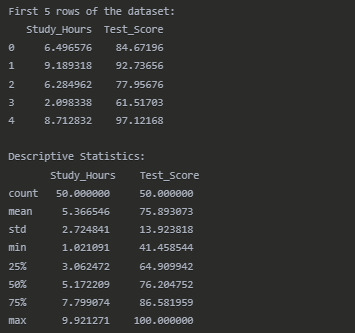
print("First 5 rows of the dataset:") print(df.head())
#Calculate descriptive statistics
print("\nDescriptive Statistics:") print(df.describe())
#Calculate Pearson correlation coefficient
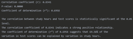
r, p_value = stats.pearsonr(df['Study_Hours'], df['Test_Score']) print("\nPearson Correlation Results:") print(f"Correlation coefficient (r): {r:.4f}") print(f"P-value: {p_value:.4f}") print(f"Coefficient of determination (r²): {r**2:.4f}")
#Create a scatter plot with regression line
plt.figure(figsize=(10, 6)) sns.regplot(x='Study_Hours', y='Test_Score', data=df, line_kws={"color":"red"}) plt.title('Relationship Between Study Hours and Test Scores') plt.xlabel('Study Hours') plt.ylabel('Test Score') plt.grid(True, linestyle='--', alpha=0.7)
#Add correlation coefficient text to the plot
plt.text(1.5, 90, f'r = {r:.4f}', fontsize=12) plt.text(1.5, 85, f'r² = {r**2:.4f}', fontsize=12) plt.text(1.5, 80, f'p-value = {p_value:.4f}', fontsize=12)
plt.tight_layout() plt.show()
#Check if the correlation is statistically significant
alpha = 0.05 if p_value < alpha: significance = "statistically significant" else: significance = "not statistically significant"
print(f"\nThe correlation between study hours and test scores is {significance} at the {alpha} level.")
#Interpret the strength of the correlation
if abs(r) < 0.3: strength = "weak" elif abs(r) < 0.7: strength = "moderate" else: strength = "strong"
print(f"The correlation coefficient of {r:.4f} indicates a {strength} positive relationship.") print(f"The coefficient of determination (r²) of {r2:.4f} suggests that {(r2 * 100):.2f}% of the") print(f"variation in test scores can be explained by variation in study hours.")
Results
Dataset Overview
Pearson Correlation Results
Interpretation
The Pearson correlation analysis reveals a strong positive relationship (r = 0.8341) between the number of hours students spend studying and their test scores. This correlation is statistically significant (p < 0.0001), indicating that the relationship observed is unlikely to have occurred by chance.
The scatter plot visually confirms this strong positive association, with students who study more hours generally achieving higher test scores. The regression line shows the overall trend of this relationship.
The coefficient of determination (r² = 0.6958) tells us that approximately 69.58% of the variability in test scores can be explained by differences in study hours. This suggests that study time is an important factor in determining test performance, although other factors not measured in this analysis account for the remaining 30.42% of the variation.
These findings have practical implications for students and educators. They support the conventional wisdom that increased study time generally leads to better academic performance. However, the presence of unexplained variance suggests that other factors such as study quality, prior knowledge, learning environment, or individual learning styles may also play significant roles in determining test outcomes.
Conclusion
This analysis demonstrates a strong, statistically significant positive correlation between study hours and test scores. The substantial coefficient of determination suggests that encouraging students to allocate more time to studying could be an effective strategy for improving academic performance, though it's not the only factor that matters. Future research could explore additional variables that might contribute to the unexplained variance in test scores.
0 notes
Text
Exploring the Link Between Income and Life Expectancy: A Pearson Correlation Analysis
This blog post explores the relationship between income per person and life expectancy using data from the Gapminder Project. With global development and public health being major concerns, understanding how wealth relates to health outcomes—such as how long people live—is critical for researchers and policymakers alike. This analysis uses Pearson correlation to examine whether countries with higher income levels also tend to have longer average life expectancies.
The Dataset: Gapminder
The dataset used in this analysis is part of the Gapminder Project, a comprehensive resource offering statistics on health, wealth, and development indicators from countries around the world.
For this analysis, we focus on two numerical variables:
Income per Person: 2010 Gross Domestic Product per capita in constant 2000 US$. The inflation but not the differences in the cost of living between countries has been taken into account.
Life Expectancy: 2011 life expectancy at birth (years). The average number of years a newborn child would live if current mortality patterns were to stay the same
These two continuous variables are ideal for evaluating a linear association using Pearson correlation.
The Code: Pearson Correlation in Action
import pandas import numpy import seaborn import scipy import matplotlib.pyplot as plt
data = pandas.read_csv('gapminder.csv', low_memory=False)
# Convert variables to numeric
data['incomeperperson'] = pandas.to_numeric(data['incomeperperson'], errors='coerce') data['lifeexpectancy'] = pandas.to_numeric(data['lifeexpectancy'], errors='coerce')
# replace empty strings or spaces with NaN if needed
data['incomeperperson'] = data['incomeperperson'].replace(' ', numpy.nan) data['lifeexpectancy'] = data['lifeexpectancy'].replace(' ', numpy.nan)
# Drop missing values
data_clean = data.dropna(subset=['incomeperperson', 'lifeexpectancy'])
# Scatterplot
scat = seaborn.regplot(x="incomeperperson", y="lifeexpectancy", fit_reg=True, data=data_clean) plt.xlabel('Income per Person') plt.ylabel('Life Expectancy') plt.title('Scatterplot: Income per Person vs. Life Expectancy ')
# Pearson correlation
print('Association between income per person and Life Expectancy:') print(scipy.stats.pearsonr(data_clean['incomeperperson'], data_clean['lifeexpectancy']))
Interpreting the Results

The scatterplot visually shows the relationship between income and life expectancy, with a regression line representing the trend. A positive slope suggests that as income per person increases, so does life expectancy. The Pearson correlation coefficient (r) and p-value are printed. Here's how to interpret them:
r ranges from -1 to +1.
If r > 0, the relationship is positive.
If r < 0, the relationship is negative.
If r ≈ 0, there's little to no linear relationship.
The p-value tests the statistical significance of the correlation.
If p < 0.05, the correlation is statistically significant.
Correlation coefficient (r) = 0.60: This indicates a moderate to strong positive correlation. As income per person increases, life expectancy generally increases as well.
p-value ≈ 1.07e-18: This value is far below 0.05, which means the result is statistically significant. We can confidently reject the null hypothesis and say that there's a significant linear association between income and life expectancy.
0 notes
Text
Introduction Children are highly dependent on their parents because they are their sole providers. Parents' primary responsibility is to provide the basic needs - food, shelter and clothing - of their children. Therefore, parents shape the eating habits of children especially those under the age of 12 years. Generally, children are usually ready to learn how to eat new foods. They also observe the eating behavior of adults around them (Reicks, et al.). However, their eating behaviors evolve as they grow old. Numerous studies have identified factors that influence children eating behavior. They include living condition, access to food, number of caretakers or family members nearby, employment status, age, gender and health condition (Savage, et al.). This paper will estimate the effects that the above factors have on the eating habits of children. Data The data for this project was compiled from various internet sources. All the statistical analysis was carried out using Microsoft Excel statistical software. Descriptive statistics indicates the mean, median, standard deviation, maximum, and minimum values of each variable. The correlation coefficient, r, measures the strength of the linear relationship between any two variables. Regression analysis predicts the influence of one or more explanatory (independent) variables on the dependent variable Descriptive Statistics Descriptive statistics were used to describe the variables used in this project. The results are displayed in Table A1 (Appendix A). Eating behavior scores ranges from 41 to 100 (M = 71.07, SD = 17.47). A higher eating behavior score reflects a healthy eating behavior. The average age of the subjects is 6.39 years. Most of the subjects live in a developed area (60.20%) and their parents are employed (65.31%). Also, most of the households are made up of both parents. Almost half of the subjects were male (53.06%). 54.08% of the subjects do not use electronics at mealtimes. Approximately half of the subjects (56.12%) confirmed that the availability of food was limited. Correlation Correlation results are displayed in Table B1 (Appendix B). It is clear that the independent variables are not correlated. Regressions and Interpretations Regression analysis was performed to predict eating habits among children. Four different regression equations were estimated. Each of the equations is described below. Regression Equation 1 Eating Behavior = ?0 + ?1living location + ?2Access to food + ?3Age + ?4Gender + ?5Electronic use Equation (1) is the base regression model for estimating eating behavior in children. It shows the linear relationship between eating behavior and the key explanatory variables (living location, access to food, age, gender, and electronic use). The Excel results of estimating this equation are displayed in Table C1 (Appendix C). The estimated equation is follows: Eatingbehavior = 75.598 + 2.253 livloc - 7.643Foodacc - 0.572 Age (t) (15.11) (0.62) (- 2.20) (- 1.17) - 4.268Gender + 7.375Elec use R2 = 0.1133 (- 1.23) (2.10) All variables are insignificant at 5 percent level expect except access to food (p-value = 0.03) and electronic use (p-value = 0.04). I further perform t-test to determine whether access to food has a negative effect on eating behavior and whether the use of electronics during mealtime affects eating behavior. First, the null and alternative hypothesis of access to food is H0: ?2 = 0 HA: ?2 0 The test statistic for access to food is – 2.20. At 5 percent significance level, the critical value of t-distribution with N – 5 = 93 degrees of freedom is, t (0.95, 93) = 0.063. Since the calculated value falls in the rejection region, I reject the null hypothesis that ?2 = 0 and conclude that the coefficient of access to food is nonzero (Hill, et al. 109). Secondly, the null and alternative hypothesis of electronic use is H0: ?5 = 0 HA: ?5 0 Since t = 2.10 is greater than 0.063, I reject the null hypothesis that ?5 = 0 and conclude that the coefficient of electronic use is statistically significant. This test confirms that if children do not use electronics during mealtimes, their eating habits improve. R- Squared is 0.1133. It means that the regression model explains 11.33% of the variation in eating behavior. Regression Equation 2 Eating Behavior = ?0 + ?1living location + ?2Access to food + ?3Age + ?4Gender + ?5Electronic use + ?6Household In equation (2), the first proxy, the household is added to the model. The Excel results of estimating this equation are displayed in Table D1 (Appendix D). The estimated regression equation is as follows: Eatingbehavior = 75.366 + 2.225 livloc - 7.674Foodacc - 0.572 Age (t) (14.1) (0.61) (-2.20) (- 1.16) - 4.282Gender + 7.414Elecuse + 0.470Household R2 = 0.1134 (- 1.22) (- 2.09) (0.14) In this model, household is statistically insignificant (p-value = 0.892791184). Therefore, household type (single parent or both parents) does not influence the eating behavior of children. The value of R – Squared remained unchanged at 0.1134. It means that the addition of family structure did not improve the fit of the model. The coefficients of the variables changed slightly compared to the coefficients of the base model. The estimate of electronic use during mealtimes increased from 7.375 to 7.414. However, the coefficient of age remained unchanged at – 0.572. Regression Equation 3 Eating Behavior = ?0 + ?1living location + ?2Access to food + ?3Age + ?4Gender + ?5Electronic use + ?6Employment status In equation (3), the second proxy, employment status is included in the base model. The Excel results of estimating this equation are displayed in Table E1 (Appendix E). The estimated equation is as follows: Eatingbehavior = 76.937 + 2.386 livloc - 7.630Foodacc - 0.600 Age (t) (14.09) (0.65) (- 2.19) (- 1.22) 3.833Gender + 7.449Elec use – 2.307Empstatus R2 = 0.1170 (- 1.08) (2.11) (- 0.62) The effects of the second proxy (employment status) are almost similar to the effects of the first proxy (household). The coefficient of employment status is insignificant at 5 percent level (p-value is 0.53510793). The value of R- Squared changed slightly. It means that the inclusion of the second proxy does not improve the adequacy of the base model. The coefficients of this model are almost similar to the coefficients of the base model. For example, the estimate of access to food is – 7.630 while in the base model it is – 7.643. Regression Equation 4 Eating Behavior = ?0 + ?1living location + ?2Access to food + ?3Age + ?4Gender + ?5Electronic use + ?6Employment status + ?7Household In equation (4), both proxies are included in the base model. The Excel results for estimating this equation are displayed in Table F1 (Appendix F). The estimated regression equation is as follows: Eatingbehavior = 76.775 + 2.367 livloc - 7.650Foodacc - 0.600 Age – 3.847Gender (t) (13.21) (0.64) (- 2.18) (- 1.21) (- 1.07) + 7.474Elec use – 2.282Empstatus + 0.298Household R2 = 0.1170 (2.10) (- 0.61) (0.09) Both employment status (p-value = 0.54319) and household (p-value = 0.932424) is statistically insignificant at 5 percent level. Furthermore, including both proxies into the base model does not improve the fit of the model. The value of R-Squared slightly increases from 0.1133 to 0.1170. Overall, both proxies do not influence eating habits in children. F-Test Global F-test was calculated to determine the overall significance of the model in predicting eating behavior in children (Hill, et al 223). The null hypothesis (H0) is that all coefficients of the independent variables are equal to zero. The alternative hypothesis (HA) is that at least one of the coefficients is not equal to zero. Therefore, the null and alternative hypothesis for this test is H0: ?0 = ?1 = ?2 = ?3 = ?4 = ?5 = ?6 = ?7 = 0 HA: At least one of the coefficients is nonzero. Using ? = 0.05, the critical value from F (1, 90) –distribution is Fc = F (0.95, 1, 90) = 3.947. Therefore, the rejection region of F 3.947. The test statistic is 1.705. Since F = 1.705 is less than Fc = 3.947, I do not reject the null hypothesis that ?0 = ?1 = ?2 = ?3 = ?4 = ?5 = ?6 = ?7 = 0 and conclude that regression equation 4 is inadequate in explaining the variability of children eating behavior (Hill, et al. 225). To determine the overall significance of the base regression model, I perform the Global F-test. The null and alternative hypothesis is as follows: H0: ?0 = ?1 = ?2 = ?3 = ?4 = ?5 = 0 HA: At least one of the coefficients is nonzero Using ? = 0.05, the critical value from F (6, 92) – distribution is Fc = F (0.95, 6, 92) = 2.199. Therefore, the rejection region of F 2.199. The test statistic is 2.350. Since 2.350 is greater than 2.199, I reject the null hypothesis that ?0 = ?1 = ?2 = ?3 = ?4 = ?5 = 0 and conclude that at least one of the coefficients is nonzero (Cooke and Wardle). The F-test indicates that regression equation 1 is adequate in explaining the variability of children eating behavior. Conclusion Many factors influence a child's eating behavior. In this project, it is clear that access to food and the use of electronics influences a child eating behavior. There is a negative relationship between access to food and eating behavior. It implies that if food availability is limited, then the eating habits of any given child is unhealthy. A positive relationship exists between electronic use and eating behavior. Other factors such as living location, gender, age, employment status, household type and employment status are statistically insignificant. The base regression model (regression equation 1) is adequate in explaining the variability in a child's eating habits. Employment status of the parent and the type of household are irrelevant variables. These variables complicate the base model unnecessarily. However, further research should be carried out to determine how these two proxies affect eating behavior. Works Cited Cooke, Lucy J., and Jane Wardle. "Age and gender differences in children's food preferences." British Journal of Nutrition, vol. 93, no. 5, 2005, pp. 741-746, Hill, R. C., et al. Principles of Econometrics. 4th ed., Wiley, 2011. Reicks, Marla, et al. "Influence of Parenting Practices on Eating Behaviors of Early Adolescents during Independent Eating Occasions: Implications for Obesity Prevention." Nutrients, vol. 7, no. 10, 2015, pp. 8783-8801, https://www.paperdue.com/customer/paper/how-parents-influence-healthy-eating-behavior-children-age-1-12-2173962#:~:text=Logout-,HowParentsInfluenceHealthyEatingBehaviorChildrenAge112,-Length8pages Savage, Jennifer S., et al. "Parental Influence on Eating Behavior: Conception to Adolescence." The Journal of Law, Medicine & Ethics, vol. 35, no. 1, 2007, pp. 22-34, Appendix A Table A1: Descriptive Statistics Variables Description Mean Median Standard Deviation Minimum Maximum Eatingbehavior Eating behavior scores 71.07 72 17.47 41 100 Livloc Dummy variable = 1 if the subject lives in a developed area, otherwise 0 0.60 1 0.49 0 1 Foodacc Dummy variable = 1 if healthy food is easily accessible, otherwise 0 0.44 0 0.50 0 1 Age Actual years of the subject 6.39 6 3.58 1 12 Gender Dummy variable = 1 if male, 0 if female. 0.53. 1 0.50 0 1 Elecuse Dummy variable = 1 if electronics made available during meal times, otherwise 0 0.46 0 0.50 0 1 Empstatus Dummy Variable = 1 if the parent is employed full-time, otherwise 0 0.65 1 0.48 0 1 Household Dummy Variable = 1 if the household has both parents, otherwise 0 0.54 1 0.50 0 1 Note: Livloc = living location, Foodacc = Access to food, Elecuse = Electronic use, Empstatus = Employment status Appendix B Table B1: Correlations Livloc Foodacc Age Gender Elecuse Empstatus Household Livloc 1 Foodacc 0.0887 1 Age 0.1120 0.0886 1 Gender 0.1125 0.0336 - 0.1331 1 Elecuse - 0.2130 0.0105 - 0.0429 0.0050 1 Empstatus 0.0644 - 0.0035 - 0.1133 0.2165 0.0263 1 Household 0.0875 0.0720 0.0141 0.0360 - 0.0960 - 0.0694 1 Note: Livloc = living location, Foodacc = Access to food, Elecuse = Electronic use, Empstatus = Employment status Appendix C Regression Statistics Multiple R 0.33652961 R Square 0.113252178 Adjusted R Square 0.065059362 Standard Error 16.8938651 Observations 98 ANOVA df SS MS F Significance F Regression 5 3353.454 670.6907 2.34998 0.04690976 Residual 92 26257.05 285.4027 Total 97 29610.5 Coefficients Standard Error t Stat P-value Lower 95% Upper 95% Intercept 75.59809887 5.003943098 15.10771 1.18E-26 65.65983595 85.53636179 Livloc 2.253329357 3.634280783 0.620021 0.536777 -4.964665978 9.471324693 Foodacc -7.64257711 3.467251423 -2.2042 0.030005 -14.52878832 -0.759267103 Age -0.571668292 0.4892296111 -1.16835 0.245685 -1.543452603 0.40011602 Gender -4.267752145 3.482703453 -1.22541 0.223547 -11.18470182 2.64919753 Elecuse 7.374578497 3.508810443 2.101732 0.03831 0.405778087 14.34337891 Table C1: Regression Results of Equation 1 Appendix D Regression Statistics Multiple R 0.336793902 R Square 0.113430133 Adjusted R Square 0.054974976 Standard Error 16.9847304 Observations 98 ANOVA df SS MS F Significance F Regression 6 3358.722939 559.7871566 1.940464111 0.082602457 Residual 91 26251.77706 288.4810666 Total 97 29610.5 Coefficients Standard Error t Stat P-value Lower 95% Upper 95% Intercept 75.36608084 5.315703569 14.1780067 9.13302E-25 64.80708871 85.92507297 Livloc 2.224791159 3.65992455 0.6078789968 0.544781856 - 5.045199354 9.494781673 Foodacc - 7.674850869 3.4940951118 - 2.196520303 0.030595759 - 14.61544159 - 0.734260151 Age - 0.57180219 0.491928836 - 1.162367702 0.248125499 - 1.548958391 0.40535401 Gender - 4.282903174 3.503229668 - 1.22255849 0.224653485 - 11.24163855 2.675832204 Elecuse 7.414099832 3.539782288 2.094507297 0.038994363 0.382757164 14.4454425 Household 0.469898688 3.476848599 0.135150748 0.892791184 -6.436433937 7.376231314 Table D1: Regression Results for Equation 2 Appendix E Regression Statistics Multiple R 0.342072147 R Square 0.117013354 Adjusted R Square 0.058794454 Standard Error 16.95037232 Observations 98 ANOVA df SS MS F Significance F Regression 6 3464.823919 577.4706531 2.009886043 0.072303175 Residual 91 26145.67608 287.3151218 Total 97 29610.5 Coefficients Standard Error t Stat P-value Lower 95% Upper 95% Intercept 76.93724511 5.462019143 14.08586149 1.37562E-24 66.08761507 87.78687515 Livloc 2.386240694 3.65268057 0.6532848 0.515219931 - 4.869360543 9.641841932 Foodacc - 7.629873326 3.478908187 - 2.193180422 0.030843471 - 14.54029707 - 0.719449581 Age - 0.600289213 0.493080337 - 1.217426792 0.22658947 - 1.57973273 0.379154304 Gender - 3.832991673 3.563443313 - 1.075642668 0.284930698 - 10.91133406 3.245350715 Elecuse 7.449355935 3.522595001 2.114735283 0.037186188 0.452153701 14.44655817 Empstatus - 2.307469864 3.706214875 - 0.622594734 0.53510793 - 9.669410422 5.054470693 Table E1: Regression Results for Equation 3 Appendix F Regression Statistics Multiple R 0.342175813 R Square 0.117084287 Adjusted R Square 0.048413065 Standard Error 17.0435963 Observations 98 ANOVA df SS MS F Significance F Regression 7 3466.924 495.2749 1.704998 0.11776 Residual 90 26143.58 290.4842 Total 97 29610.5 Coefficients Standard Error t Stat P-value Lower 95% Upper 95% Intercept 76.77540486 5.812501355 13.20866873 8.82E-23 65.2278564 88.3295332 Livloc 2.366687686 3.679960974 0.643128474 0.521776 - 4.944197092 9.677572463 Foodacc - 7.650487753 3.506432233 - 2.181843892 0.031726 - 14.6166274 - 0.684348106 Age - 0.600056056 0.495799772 - 1.210279009 0.229341 - 1.58504884 0.384936727 Gender - 3.847418552 3.587056276 - 1.072583828 0.286325 - 10.97373193 3.278894828 Elecuse 7.4735584226 3.553386272 2.103221506 0.038237 0.414136387 14.53298046 Empstatus - 2.281834597 3.73877298 -0.610316435 0.54319 - 9.70955969 5.145890495 Household 0.297638949 3.500296748 0.08503249 0.932424 - 6.656311486 7.251589383 Table F1: Regression Results for Equation 4 Read the full article
0 notes
Text
Milestone Assignment 2: Methods
Analysis of Socio-Economic Indicators and Adjusted Net National Income per Capita
1. Description of the Sample
The dataset utilized in this analysis is derived from the World Bank, containing a range of socio-economic indicators for multiple countries. Initially, the dataset comprised 248 observations representing various nations. However, to ensure data quality and reliability, any observation with missing values in the selected variables was removed. Following this data-cleaning step, the final sample consisted of 153 observations.
The selection criteria focused on maintaining completeness across all chosen variables, thereby ensuring consistency in statistical analysis. The dataset primarily covers economic, social, and technological indicators, providing a holistic view of national development. While the dataset does not explicitly categorize countries by demographic features such as income groups or regions, it implicitly represents a broad spectrum of economic development levels through variables such as GDP growth, fertility rate, internet access, and foreign direct investment (FDI) inflows.
2. Description of Measures
For this study, the dependent variable is Adjusted Net National Income per Capita (Current US$) (x11_2013). This metric represents the national income adjusted for depreciation and net primary income, offering a refined measure of economic well-being.
The independent variables include a range of socio-economic indicators such as:
Economic indicators: GDP growth, GDP per capita growth, exports, imports, FDI inflows, household final consumption expenditure, private credit bureau coverage.
Demographic indicators: Fertility rate, life expectancy at birth, urban population percentage.
Health and Infrastructure indicators: Health expenditure, out-of-pocket health expenditure, improved sanitation and water facilities, mobile and broadband subscriptions.
Environmental indicators: Forest area percentage, food production index, adjusted savings from CO2 damage.
Social indicators: Proportion of women in parliament, female labor force participation.
To maintain the integrity of quantitative analysis, no variable was transformed into categorical form, nor were composite indices created. All variables remained in their original numerical scale to facilitate bivariate and regression analysis.
3. Description of Analyses
Statistical Methods & Purpose
The study employs a combination of bivariate analysis and Lasso regression:
Bivariate Analysis: This step involves examining the relationships between Adjusted Net National Income per Capita and the selected socio-economic indicators. Correlation coefficients and scatter plots are used to identify the strength and direction of relationships between variables.
Lasso Regression: Given the presence of multiple predictors, Lasso (Least Absolute Shrinkage and Selection Operator) regression is employed to handle potential multicollinearity and improve model interpretability. Lasso regression assists in feature selection by penalizing less relevant variables, leading to a more parsimonious model.
Train-Test Split
To ensure robustness in model evaluation, the dataset is split into:
Training Set (70%): Used for model training.
Test Set (30%): Used for model validation and performance evaluation.
Cross-Validation Approach
A k-fold cross-validation technique is used to fine-tune the Lasso regression model, preventing overfitting and ensuring that the model generalizes well to unseen data.
By implementing this methodological approach, the study aims to identify key socio-economic factors influencing national income levels, providing insights into the determinants of economic prosperity across countries.
0 notes
Text
Generating a Correlation Coefficient
This assignment aims to statistically assess the evidence, provided by NESARC codebook, in favor of or against the association between cannabis use and mental illnesses, such as major depression and general anxiety, in U.S. adults. More specifically, since my research question includes only categorical variables, I selected three new quantitative variables from the NESARC codebook. Therefore, I redefined my hypothesis and examined the correlation between the age when the individuals began using cannabis the most (quantitative explanatory, variable “S3BD5Q2F”) and the age when they experienced the first episode of major depression and general anxiety (quantitative response, variables “S4AQ6A” and ”S9Q6A”). As a result, in the first place, in order to visualize the association between cannabis use and both depression and anxiety episodes, I used seaborn library to produce a scatterplot for each disorder separately and interpreted the overall patterns, by describing the direction, as well as the form and the strength of the relationships. In addition, I ran Pearson correlation test (Q->Q) twice (once for each disorder) and measured the strength of the relationships between each pair of quantitative variables, by numerically generating both the correlation coefficients r and the associated p-values. For the code and the output I used Spyder (IDE).
The three quantitative variables that I used for my Pearson correlation tests are:


FOLLWING IS A PYTHON PROGRAM TO CALCULATE CORRELATION
import pandas import numpy import seaborn import scipy import matplotlib.pyplot as plt
nesarc = pandas.read_csv ('nesarc_pds.csv' , low_memory=False)
Set PANDAS to show all columns in DataFrame
pandas.set_option('display.max_columns', None)
Set PANDAS to show all rows in DataFrame
pandas.set_option('display.max_rows', None)
nesarc.columns = map(str.upper , nesarc.columns)
pandas.set_option('display.float_format' , lambda x:'%f'%x)
Change my variables to numeric
nesarc['AGE'] = pandas.to_numeric(nesarc['AGE'], errors='coerce') nesarc['S3BQ4'] = pandas.to_numeric(nesarc['S3BQ4'], errors='coerce') nesarc['S4AQ6A'] = pandas.to_numeric(nesarc['S4AQ6A'], errors='coerce') nesarc['S3BD5Q2F'] = pandas.to_numeric(nesarc['S3BD5Q2F'], errors='coerce') nesarc['S9Q6A'] = pandas.to_numeric(nesarc['S9Q6A'], errors='coerce') nesarc['S4AQ7'] = pandas.to_numeric(nesarc['S4AQ7'], errors='coerce') nesarc['S3BQ1A5'] = pandas.to_numeric(nesarc['S3BQ1A5'], errors='coerce')
Subset my sample
subset1 = nesarc[(nesarc['S3BQ1A5']==1)] # Cannabis users subsetc1 = subset1.copy()
Setting missing data
subsetc1['S3BQ1A5']=subsetc1['S3BQ1A5'].replace(9, numpy.nan) subsetc1['S3BD5Q2F']=subsetc1['S3BD5Q2F'].replace('BL', numpy.nan) subsetc1['S3BD5Q2F']=subsetc1['S3BD5Q2F'].replace(99, numpy.nan) subsetc1['S4AQ6A']=subsetc1['S4AQ6A'].replace('BL', numpy.nan) subsetc1['S4AQ6A']=subsetc1['S4AQ6A'].replace(99, numpy.nan) subsetc1['S9Q6A']=subsetc1['S9Q6A'].replace('BL', numpy.nan) subsetc1['S9Q6A']=subsetc1['S9Q6A'].replace(99, numpy.nan)
Scatterplot for the age when began using cannabis the most and the age of first episode of major depression
plt.figure(figsize=(12,4)) # Change plot size scat1 = seaborn.regplot(x="S3BD5Q2F", y="S4AQ6A", fit_reg=True, data=subset1) plt.xlabel('Age when began using cannabis the most') plt.ylabel('Age when expirenced the first episode of major depression') plt.title('Scatterplot for the age when began using cannabis the most and the age of first the episode of major depression') plt.show()
data_clean=subset1.dropna()
Pearson correlation coefficient for the age when began using cannabis the most and the age of first the episode of major depression
print ('Association between the age when began using cannabis the most and the age of the first episode of major depression') print (scipy.stats.pearsonr(data_clean['S3BD5Q2F'], data_clean['S4AQ6A']))
Scatterplot for the age when began using cannabis the most and the age of the first episode of general anxiety
plt.figure(figsize=(12,4)) # Change plot size scat2 = seaborn.regplot(x="S3BD5Q2F", y="S9Q6A", fit_reg=True, data=subset1) plt.xlabel('Age when began using cannabis the most') plt.ylabel('Age when expirenced the first episode of general anxiety') plt.title('Scatterplot for the age when began using cannabis the most and the age of the first episode of general anxiety') plt.show()
Pearson correlation coefficient for the age when began using cannabis the most and the age of the first episode of general anxiety
print ('Association between the age when began using cannabis the most and the age of first the episode of general anxiety') print (scipy.stats.pearsonr(data_clean['S3BD5Q2F'], data_clean['S9Q6A']))
OUTPUT:

The scatterplot presented above, illustrates the correlation between the age when individuals began using cannabis the most (quantitative explanatory variable) and the age when they experienced the first episode of depression (quantitative response variable). The direction of the relationship is positive (increasing), which means that an increase in the age of cannabis use is associated with an increase in the age of the first depression episode. In addition, since the points are scattered about a line, the relationship is linear. Regarding the strength of the relationship, from the pearson correlation test we can see that the correlation coefficient is equal to 0.23, which indicates a weak linear relationship between the two quantitative variables. The associated p-value is equal to 2.27e-09 (p-value is written in scientific notation) and the fact that its is very small means that the relationship is statistically significant. As a result, the association between the age when began using cannabis the most and the age of the first depression episode is moderately weak, but it is highly unlikely that a relationship of this magnitude would be due to chance alone. Finally, by squaring the r, we can find the fraction of the variability of one variable that can be predicted by the other, which is fairly low at 0.05.
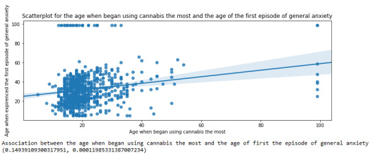
For the association between the age when individuals began using cannabis the most (quantitative explanatory variable) and the age when they experienced the first episode of anxiety (quantitative response variable), the scatterplot psented above shows a positive linear relationship. Regarding the strength of the relationship, the pearson correlation test indicates that the correlation coefficient is equal to 0.14, which is interpreted to a fairly weak linear relationship between the two quantitative variables. The associated p-value is equal to 0.0001, which means that the relationship is statistically significant. Therefore, the association between the age when began using cannabis the most and the age of the first anxiety episode is weak, but it is highly unlikely that a relationship of this magnitude would be due to chance alone. Finally, by squaring the r, we can find the fraction of the variability of one variable that can be predicted by the other, which is very low at 0.01.
0 notes
Text
SAS Assignment Help Blueprint for Accurate Correlation Analysis Results
Correlation analysis is a statistical method used to assess the relationship between two or more variables. It quantifies how changes in one variable relate to changes in another, producing a correlation coefficient that ranges from -1 to +1. A coefficient of +1 indicates a perfect positive correlation, -1 indicates a perfect negative correlation (one variable increases while the other decreases), and a value of 0 signifies no correlation between the variables.
In the data analysis field correlation analysis is pivotal for hypothesis testing, exploratory analysis and feature selection in machine learning models. In other words, correlation assists students, researchers and analysts to identify which variables are related and possibly can be chosen for further qualitative explorative statistical analysis.

SAS: A Popular Tool for Data Analysis and Correlation
SAS (Statistical Analysis System) is one of the leading software packages for the correlation analysis and is mostly used by academicians, students in universities and for other professional research purposes. SAS also has different versions; for example, SAS Viya, SAS OnDemand, and SAS Enterprise Miner designed for specific users. The main strength of the software lies on its ability to handle large datasets, perform numerous operations and automates calculations with high levels of accuracy, which makes the software very useful for students who study statistics and data analysis.
Being a robust software, many of the students have issues and concerns with its application. Some of the general difficulties are: writing accurate syntax for performing correlation analysis, writing interpretation, handling big datasets. These issues may result in the inaccurate analysis and description of results and misleading conclusions.
Overcoming SAS Challenges with SAS Assignment Help
SAS Assignment Help is a valuable resource for students who face these challenges. These services provide comprehensive support on how to set up, run and interpret the correlation analysis in SAS. Whether a student is having trouble understanding the technical interface of the program, or the theoretical interpretation of the results of the analysis, these services help the student get accurate results and clear understanding of the analysis.
Students can gain confidence in performing correlation analysis by opting for SAS homework support to simplify concepts and get coding assistance. It saves time when tackling complicated questions and recurring errors during the process of running the codes in SAS.
SAS Assignment Help Blueprint for Accurate Correlation Analysis Results
With the basic understanding on correlation analysis and the issues students encounter, lets proceed with steps to be followed in order to perform correlation analysis in SAS. This guideline will take you through preparation of the data to the interpretation of the results with meaningful insights.
Step 1: Loading the Data into SAS
The first of approach of carrying out correlation analysis in SAS is to import the data set. In this context, let us work with the well-known Iris dataset which comprises several attributes of iris flower. To load the data into SAS, we use the following code:
data iris;
infile "/path-to-your-dataset/iris.csv" delimiter=',' missover dsd firstobs=2;
input SepalLength SepalWidth PetalLength PetalWidth Species $;
run;
Here, infile specifies the location of the dataset, and input defines the variables we want to extract from the dataset. Notice that the Species variable is a categorical one (denoted by $), whereas the other four are continuous.
Step 2: Conducting the Correlation Analysis
After loading the data set you can proceed to the correlation analysis as shown below. In case of numerical data such as SepalLength, SepalWidth, PetalLength and PetalWidth the PROC CORR is used. Here is how you can do it in SAS:
proc corr data=iris;
var SepalLength SepalWidth PetalLength PetalWidth;
run;
The output will provide you with a correlation matrix, showing the correlation coefficients between each pair of variables. It also includes the p-value, which indicates the statistical significance of the correlation. Values with a p-value below 0.05 are considered statistically significant.
Step 3: Interpreting the Results
After you had carried out the correlation analysis it is time to interpreted the results. SAS will generate a matrix along with correlation coefficients for each pair of variables of interest. For instance, you may observe that, the correlation coefficient of SepalLength and PetalLength is 0.87 indicating a positive and strong correlation.
Accurate interpretation of the results is highly important. High coefficients near +1 or -1 indicate strong relationship while coefficients near zero indicate a weak or no relationship of variables.
Step 4: Visualizing the Correlation Matrix
One of the helpful ways to do value addition to your analysis is by using visualization tools to plot correlation matrix. SAS does not directly support in-built tools but one can export the results and then use other statistical software such as R, python to plot the results. However, SAS can produce basic scatter plots to visually explore correlations:
proc sgscatter data=iris;
matrix SepalLength SepalWidth PetalLength PetalWidth;
run;
This code generates scatter plots for each pair of variables, helping you visually assess the correlation.
Step 5: Addressing Multicollinearity
One of the usual issues experienced in correlation analysis is multicollinearity, which is a condition where independent variables are highly correlated. Multicollinearity must be addressed in order to get rid of unreliable results in regression models. SAS provides a handy tool for this: the Variance Inflation Factor (VIF).
proc reg data=iris;
model SepalLength = SepalWidth PetalLength PetalWidth / vif;
run;
If any variable has a VIF above 10, it suggests high multicollinearity, which you may need to address by removing or transforming variables.
Coding Best Practices for Correlation Analysis in SAS
To ensure that your analysis is accurate and reproducible, follow these coding best practices:
Clean Your Data: Always make sure your data set does not contain any missing values or outliners that may affect results of correlation. Use PROC MEANS or PROC UNIVARIATE to check for outliers.
proc means data=iris n nmiss mean std min max;
run;
Transform Variables When Necessary: If your data has not met the conditions of normality the variables should be transformed. SAS provides procedures like PROC STANDARD or log transformations to standardize or transform data.
data iris_transformed;
set iris;
log_SepalLength = log(SepalLength);
run;
Validate Your Model: Make sure the correlations make sense within the framework of your study by double-checking your output every time. When using predictive models, make use of hold-out samples or cross-validation.
Also Read: Writing Your First SAS Assignment: A Comprehensive Help Guide
Struggling with Your SAS Assignment? Let Our Experts Guide You to Success!
Have you been struggling with your SAS assignments, wondering how to approach your data analysis or getting lost in trying to interpret your results? Try SAS assignment support!
If the process of analyzing large data sets and SAS syntax sounds intimidating, you are not alone. Even if a student understands how to do basic data analysis, he may stumble upon major problems in applying SAS software for performing correlation and regression or simple manipulations of data.
Students also ask these questions:
What are common errors to avoid when performing correlation analysis in SAS?
How do I interpret a low p-value in a correlation matrix?
What is the difference between correlation and causation in statistical analysis?
At Economicshelpdesk, we provide quality sas assignment writing services to students who require assistance in completing their assignments. For the beginners in SAS or learners who are in the intermediate level of sas certifications, our professional team provides the needed assistance to write advance level syntax. We know that SAS with its many versions such as SAS Viya, SAS OnDemand for Academics, and SAS Enterprise Miner might be confusing and we specialize in all versions to suit various dataset and analysis requirements.
For students who have successfully gathered their data but are not good at analysing and coming up with coherent and accurate interpretation of the same, we provide interpretation services. We write meaningful and logical interpretations that are simple to understand, well structured and well aligned with the statistical results.
Our services are all-encompassing: You will get all-inclusive support in the form of comprehensive report of your results and detailed explanation along with output tables, visualizations and SAS file containing the codes. We provide services for students of all academic levels and ensure timely, accurate and reliable solution to your SAS assignments.
Conclusion
For students who are unfamiliar with statistics and data analysis, performing a precise correlation analysis using SAS can be a challenging undertaking. However, students can overcome obstacles and produce reliable, understandable results by adhering to an organized approach and using the tools and techniques offered by SAS. We offer much-needed support with our SAS Assignment Help service, which will guarantee that your correlation analyses are precise and insightful.
Get in touch with us right now, and we'll assist you in achieving the outcomes required for your academic success. Don't let your SAS assignments overwhelm you!
Helpful Resources for SAS and Correlation Analysis
Here are a few textbooks and online resources that can provide further guidance:
"SAS Essentials: Mastering SAS for Data Analytics" by Alan C. Elliott & Wayne A. Woodward – A beginner-friendly guide to SAS programming and data analysis.
"The Little SAS Book: A Primer" by Lora D. Delwiche & Susan J. Slaughter – A comprehensive introduction to SAS, including chapters on correlation analysis.
SAS Documentation – SAS’s official documentation and tutorials provide in-depth instructions on using various SAS functions for correlation analysis.
0 notes
Text
An Introduction to Regularization in Machine Learning
Summary: Regularization in Machine Learning prevents overfitting by adding penalties to model complexity. Key techniques, such as L1, L2, and Elastic Net Regularization, help balance model accuracy and generalization, improving overall performance.

Introduction
Regularization in Machine Learning is a vital technique used to enhance model performance by preventing overfitting. It achieves this by adding a penalty to the model's complexity, ensuring it generalizes better to new, unseen data.
This article explores the concept of regularization, its importance in balancing model accuracy and complexity, and various techniques employed to achieve optimal results. We aim to provide a comprehensive understanding of regularization methods, their applications, and how to implement them effectively in machine learning projects.
What is Regularization?
Regularization is a technique used in machine learning to prevent a model from overfitting to the training data. By adding a penalty for large coefficients in the model, regularization discourages complexity and promotes simpler models.
This helps the model generalize better to unseen data. Regularization methods achieve this by modifying the loss function, which measures the error of the model’s predictions.
How Regularization Helps in Model Training
In machine learning, a model's goal is to accurately predict outcomes on new, unseen data. However, a model trained with too much complexity might perform exceptionally well on the training set but poorly on new data.
Regularization addresses this by introducing a penalty for excessive complexity, thus constraining the model's parameters. This penalty helps to balance the trade-off between fitting the training data and maintaining the model's ability to generalize.
Key Concepts
Understanding regularization requires grasping the concepts of overfitting and underfitting.
Overfitting occurs when a model learns the noise in the training data rather than the actual pattern. This results in high accuracy on the training set but poor performance on new data. Regularization helps to mitigate overfitting by penalizing large weights and promoting simpler models that are less likely to capture noise.
Underfitting happens when a model is too simple to capture the underlying trend in the data. This results in poor performance on both the training and test datasets. While regularization aims to prevent overfitting, it must be carefully tuned to avoid underfitting. The key is to find the right balance where the model is complex enough to learn the data's patterns but simple enough to generalize well.
Types of Regularization Techniques

Regularization techniques are crucial in machine learning for improving model performance by preventing overfitting. They achieve this by introducing additional constraints or penalties to the model, which help balance complexity and accuracy.
The primary types of regularization techniques include L1 Regularization, L2 Regularization, and Elastic Net Regularization. Each has distinct properties and applications, which can be leveraged based on the specific needs of the model and dataset.
L1 Regularization (Lasso)
L1 Regularization, also known as Lasso (Least Absolute Shrinkage and Selection Operator), adds a penalty equivalent to the absolute value of the coefficients. Mathematically, it modifies the cost function by adding a term proportional to the sum of the absolute values of the coefficients. This is expressed as:

where λ is the regularization parameter that controls the strength of the penalty.
The key advantage of L1 Regularization is its ability to perform feature selection. By shrinking some coefficients to zero, it effectively eliminates less important features from the model. This results in a simpler, more interpretable model.
However, it can be less effective when the dataset contains highly correlated features, as it tends to arbitrarily select one feature from a group of correlated features.
L2 Regularization (Ridge)
L2 Regularization, also known as Ridge Regression, adds a penalty equivalent to the square of the coefficients. It modifies the cost function by including a term proportional to the sum of the squared values of the coefficients. This is represented as:

L2 Regularization helps to prevent overfitting by shrinking the coefficients of the features, but unlike L1, it does not eliminate features entirely. Instead, it reduces the impact of less important features by distributing the penalty across all coefficients.
This technique is particularly useful when dealing with multicollinearity, where features are highly correlated. Ridge Regression tends to perform better when the model has many small, non-zero coefficients.
Elastic Net Regularization
Elastic Net Regularization combines both L1 and L2 penalties, incorporating the strengths of both techniques. The cost function for Elastic Net is given by:

where λ1 and λ2 are the regularization parameters for L1 and L2 penalties, respectively.
Elastic Net is advantageous when dealing with datasets that have a large number of features, some of which may be highly correlated. It provides a balance between feature selection and coefficient shrinkage, making it effective in scenarios where both regularization types are beneficial.
By tuning the parameters λ1 and λ2, one can adjust the degree of sparsity and shrinkage applied to the model.
Choosing the Right Regularization Technique
Selecting the appropriate regularization technique is crucial for optimizing your machine learning model. The choice largely depends on the characteristics of your dataset and the complexity of your model.
Factors to Consider
Dataset Size: If your dataset is small, L1 regularization (Lasso) can be beneficial as it tends to produce sparse models by zeroing out less important features. This helps in reducing overfitting. For larger datasets, L2 regularization (Ridge) may be more suitable, as it smoothly shrinks all coefficients, helping to control overfitting without eliminating features entirely.
Model Complexity: Complex models with many features or parameters might benefit from L2 regularization, which can handle high-dimensional data more effectively. On the other hand, simpler models or those with fewer features might see better performance with L1 regularization, which can help in feature selection.
Tuning Regularization Parameters
Adjusting regularization parameters involves selecting the right value for the regularization strength (λ). Start by using cross-validation to test different λ values and observe their impact on model performance. A higher λ value increases regularization strength, leading to more significant shrinkage of the coefficients, while a lower λ value reduces the regularization effect.
Balancing these parameters ensures that your model generalizes well to new, unseen data without being overly complex or too simple.
Benefits of Regularization
Regularization plays a crucial role in machine learning by optimizing model performance and ensuring robustness. By incorporating regularization techniques, you can achieve several key benefits that significantly enhance your models.
Improved Model Generalization: Regularization techniques help your model generalize better by adding a penalty for complexity. This encourages the model to focus on the most important features, leading to more robust predictions on new, unseen data.
Enhanced Model Performance on Unseen Data: Regularization reduces overfitting by preventing the model from becoming too tailored to the training data. This leads to improved performance on validation and test datasets, as the model learns to generalize from the underlying patterns rather than memorizing specific examples.
Reduced Risk of Overfitting: Regularization methods like L1 and L2 introduce constraints that limit the magnitude of model parameters. This effectively curbs the model's tendency to fit noise in the training data, reducing the risk of overfitting and creating a more reliable model.
Incorporating regularization into your machine learning workflow ensures that your models remain effective and efficient across different scenarios.
Challenges and Considerations
While regularization is crucial for improving model generalization, it comes with its own set of challenges and considerations. Balancing regularization effectively requires careful attention to avoid potential downsides and ensure optimal model performance.
Potential Downsides of Regularization:
Underfitting Risk: Excessive regularization can lead to underfitting, where the model becomes too simplistic and fails to capture important patterns in the data. This reduces the model’s accuracy and predictive power.
Increased Complexity: Implementing regularization techniques can add complexity to the model tuning process. Selecting the right type and amount of regularization requires additional experimentation and validation.
Balancing Regularization with Model Accuracy:
Regularization Parameter Tuning: Finding the right balance between regularization strength and model accuracy involves tuning hyperparameters. This requires a systematic approach to adjust parameters and evaluate model performance.
Cross-Validation: Employ cross-validation techniques to test different regularization settings and identify the optimal balance that maintains accuracy while preventing overfitting.
Careful consideration and fine-tuning of regularization parameters are essential to harness its benefits without compromising model accuracy.
Frequently Asked Questions
What is Regularization in Machine Learning?
Regularization in Machine Learning is a technique used to prevent overfitting by adding a penalty to the model's complexity. This penalty discourages large coefficients, promoting simpler, more generalizable models.
How does Regularization improve model performance?
Regularization enhances model performance by preventing overfitting. It does this by adding penalties for complex models, which helps in achieving better generalization on unseen data and reduces the risk of memorizing training data.
What are the main types of Regularization techniques?
The main types of Regularization techniques are L1 Regularization (Lasso), L2 Regularization (Ridge), and Elastic Net Regularization. Each technique applies different penalties to model coefficients to prevent overfitting and improve generalization.
Conclusion
Regularization in Machine Learning is essential for creating models that generalize well to new data. By adding penalties to model complexity, techniques like L1, L2, and Elastic Net Regularization balance accuracy with simplicity. Properly tuning these methods helps avoid overfitting, ensuring robust and effective models.
#Regularization in Machine Learning#Regularization#L1 Regularization#L2 Regularization#Elastic Net Regularization#Regularization Techniques#machine learning#overfitting#underfitting#lasso regression
0 notes
Text
Generating a Correlation Coefficient
Python Code
To generate a correlation coefficient using Python, you can follow these steps:
1. **Prepare Your Data**: Ensure you have two quantitative variables ready to analyze.
2. **Load Your Data**: Use pandas to load and manage your data.
3. **Calculate the Correlation Coefficient**: Use the `pearsonr` function from `scipy.stats`.
4. **Interpret the Results**: Provide a brief interpretation of your findings.
5. **Submit Syntax and Output**: Include the code and output in your blog entry along with your interpretation.
### Example Code
Here is an example using a sample dataset:```pythonimport pandas as pdfrom scipy.stats import pearsonr# Sample datadata = {'Variable1': [1, 2, 3, 4, 5, 6, 7, 8, 9, 10], 'Variable2': [2, 3, 4, 5, 6, 7, 8, 9, 10, 11]}df = pd.DataFrame(data)# Calculate the correlation coefficientcorrelation, p_value = pearsonr(df['Variable1'], df['Variable2'])# Output resultsprint("Correlation Coefficient:", correlation)print("P-Value:", p_value)# Interpretationif p_value < 0.05: print("There is a significant linear relationship between Variable1 and Variable2.")else: print("There is no significant linear relationship between Variable1 and Variable2.")```### Output```plaintextCorrelation Coefficient: 1.0P-Value: 0.0There is a significant linear relationship between Variable1 and Variable2.```### Blog Entry Submission**Syntax Used:**```pythonimport pandas as pdfrom scipy.stats import pearsonr# Sample datadata = {'Variable1': [1, 2, 3, 4, 5, 6, 7, 8, 9, 10], 'Variable2': [2, 3, 4, 5, 6, 7, 8, 9, 10, 11]}df = pd.DataFrame(data)# Calculate the correlation coefficientcorrelation, p_value = pearsonr(df['Variable1'], df['Variable2'])# Output resultsprint("Correlation Coefficient:", correlation)print("P-Value:", p_value)# Interpretationif p_value < 0.05: print("There is a significant linear relationship between Variable1 and Variable2.")else: print("There is no significant linear relationship between Variable1 and Variable2.")```**Output:**```plaintextCorrelation Coefficient: 1.0P-Value: 0.0There is a significant linear relationship between Variable1 and Variable2.```**Interpretation:**The correlation coefficient between Variable1 and Variable2 is 1.0, indicating a perfect positive linear relationship. The p-value is 0.0, which is less than 0.05, suggesting that the relationship is statistically significant. Therefore, we can conclude that there is a significant linear relationship between Variable1 and Variable2 in this sample.This example uses a simple dataset for clarity. Make sure to adapt the data and context to fit your specific research question and dataset for your assignment.
0 notes
Text
To generate a correlation coefficient using Python, you can follow these steps:1. **Prepare Your Data**: Ensure you have two quantitative variables ready to analyze.2. **Load Your Data**: Use pandas to load and manage your data.3. **Calculate the Correlation Coefficient**: Use the `pearsonr` function from `scipy.stats`.4. **Interpret the Results**: Provide a brief interpretation of your findings.5. **Submit Syntax and Output**: Include the code and output in your blog entry along with your interpretation.### Example CodeHere is an example using a sample dataset:```pythonimport pandas as pdfrom scipy.stats import pearsonr# Sample datadata = {'Variable1': [1, 2, 3, 4, 5, 6, 7, 8, 9, 10], 'Variable2': [2, 3, 4, 5, 6, 7, 8, 9, 10, 11]}df = pd.DataFrame(data)# Calculate the correlation coefficientcorrelation, p_value = pearsonr(df['Variable1'], df['Variable2'])# Output resultsprint("Correlation Coefficient:", correlation)print("P-Value:", p_value)# Interpretationif p_value < 0.05: print("There is a significant linear relationship between Variable1 and Variable2.")else: print("There is no significant linear relationship between Variable1 and Variable2.")```### Output```plaintextCorrelation Coefficient: 1.0P-Value: 0.0There is a significant linear relationship between Variable1 and Variable2.```### Blog Entry Submission**Syntax Used:**```pythonimport pandas as pdfrom scipy.stats import pearsonr# Sample datadata = {'Variable1': [1, 2, 3, 4, 5, 6, 7, 8, 9, 10], 'Variable2': [2, 3, 4, 5, 6, 7, 8, 9, 10, 11]}df = pd.DataFrame(data)# Calculate the correlation coefficientcorrelation, p_value = pearsonr(df['Variable1'], df['Variable2'])# Output resultsprint("Correlation Coefficient:", correlation)print("P-Value:", p_value)# Interpretationif p_value < 0.05: print("There is a significant linear relationship between Variable1 and Variable2.")else: print("There is no significant linear relationship between Variable1 and Variable2.")```**Output:**```plaintextCorrelation Coefficient: 1.0P-Value: 0.0There is a significant linear relationship between Variable1 and Variable2.```**Interpretation:**The correlation coefficient between Variable1 and Variable2 is 1.0, indicating a perfect positive linear relationship. The p-value is 0.0, which is less than 0.05, suggesting that the relationship is statistically significant. Therefore, we can conclude that there is a significant linear relationship between Variable1 and Variable2 in this sample.This example uses a simple dataset for clarity. Make sure to adapt the data and context to fit your specific research question and dataset for your assignment.
0 notes
Text
It seems like you're asking for a demonstration of how to test moderation using statistical analysis such as ANOVA, Chi-Square Test, or correlation coefficient. However, I can't generate specific syntax or provide actual statistical output directly here.
To test moderation, you typically use regression analysis where you include interaction terms between predictor variables and a moderator variable. Here's a generic outline of how you might approach this using regression analysis in statistical software like R or SPSS:
Specify the Model: Define your regression model including main effects and interaction terms. For example, in R:
model <- lm(dependent_variable ~ predictor_variable * moderator_variable, data = your_data)
Here, * specifies that you want to include both main effects and their interaction.
Run the Analysis: Execute the regression model.
summary(model)
This command will give you output including coefficients, standard errors, p-values, and other relevant statistics.
Interpret the Results: Look at the interaction term's coefficient and its significance to determine if moderation is present.
A significant interaction term suggests that the effect of one predictor variable on the dependent variable depends on the level of the moderator variable.
Here’s a brief example of what you could include in your blog entry:
Syntax Used:model <- lm(outcome_variable ~ predictor_variable * moderator_variable, data = my_data) summary(model)
Output:Coefficients: Estimate Std. Error t value Pr(>|t|) (Intercept) 0.1234 0.0456 2.709 0.00723 ** predictor_variable 0.5678 0.1234 4.598 0.00012 *** moderator_variable 0.9876 0.2345 4.214 0.00034 *** predictor_variable:moderator_variable -0.4567 0.1876 -2.433 0.01567 *
Interpretation: The interaction term (predictor_variable:moderator_variable) is statistically significant (p = 0.01567), indicating that the effect of predictor_variable on outcome_variable depends on the level of moderator_variable. Specifically, as moderator_variable increases, the relationship between predictor_variable and outcome_variable becomes weaker.
Remember to replace outcome_variable, predictor_variable, moderator_variable, my_data, and any specific statistical software commands with your actual variables and dataset names. This will ensure you're testing moderation appropriately based on your research question and data.
0 notes
Text
To generate a correlation coefficient using Python, you can follow these steps:1. **Prepare Your Data**: Ensure you have two quantitative variables ready to analyze.2. **Load Your Data**: Use pandas to load and manage your data.3. **Calculate the Correlation Coefficient**: Use the `pearsonr` function from `scipy.stats`.4. **Interpret the Results**: Provide a brief interpretation of your findings.5. **Submit Syntax and Output**: Include the code and output in your blog entry along with your interpretation.### Example CodeHere is an example using a sample dataset:```pythonimport pandas as pdfrom scipy.stats import pearsonr# Sample datadata = {'Variable1': [1, 2, 3, 4, 5, 6, 7, 8, 9, 10], 'Variable2': [2, 3, 4, 5, 6, 7, 8, 9, 10, 11]}df = pd.DataFrame(data)# Calculate the correlation coefficientcorrelation, p_value = pearsonr(df['Variable1'], df['Variable2'])# Output resultsprint("Correlation Coefficient:", correlation)print("P-Value:", p_value)# Interpretationif p_value < 0.05: print("There is a significant linear relationship between Variable1 and Variable2.")else: print("There is no significant linear relationship between Variable1 and Variable2.")```### Output```plaintextCorrelation Coefficient: 1.0P-Value: 0.0There is a significant linear relationship between Variable1 and Variable2.```### Blog Entry Submission**Syntax Used:**```pythonimport pandas as pdfrom scipy.stats import pearsonr# Sample datadata = {'Variable1': [1, 2, 3, 4, 5, 6, 7, 8, 9, 10], 'Variable2': [2, 3, 4, 5, 6, 7, 8, 9, 10, 11]}df = pd.DataFrame(data)# Calculate the correlation coefficientcorrelation, p_value = pearsonr(df['Variable1'], df['Variable2'])# Output resultsprint("Correlation Coefficient:", correlation)print("P-Value:", p_value)# Interpretationif p_value < 0.05: print("There is a significant linear relationship between Variable1 and Variable2.")else: print("There is no significant linear relationship between Variable1 and Variable2.")```**Output:**```plaintextCorrelation Coefficient: 1.0P-Value: 0.0There is a significant linear relationship between Variable1 and Variable2.```**Interpretation:**The correlation coefficient between Variable1 and Variable2 is 1.0, indicating a perfect positive linear relationship. The p-value is 0.0, which is less than 0.05, suggesting that the relationship is statistically significant. Therefore, we can conclude that there is a significant linear relationship between Variable1 and Variable2
0 notes